


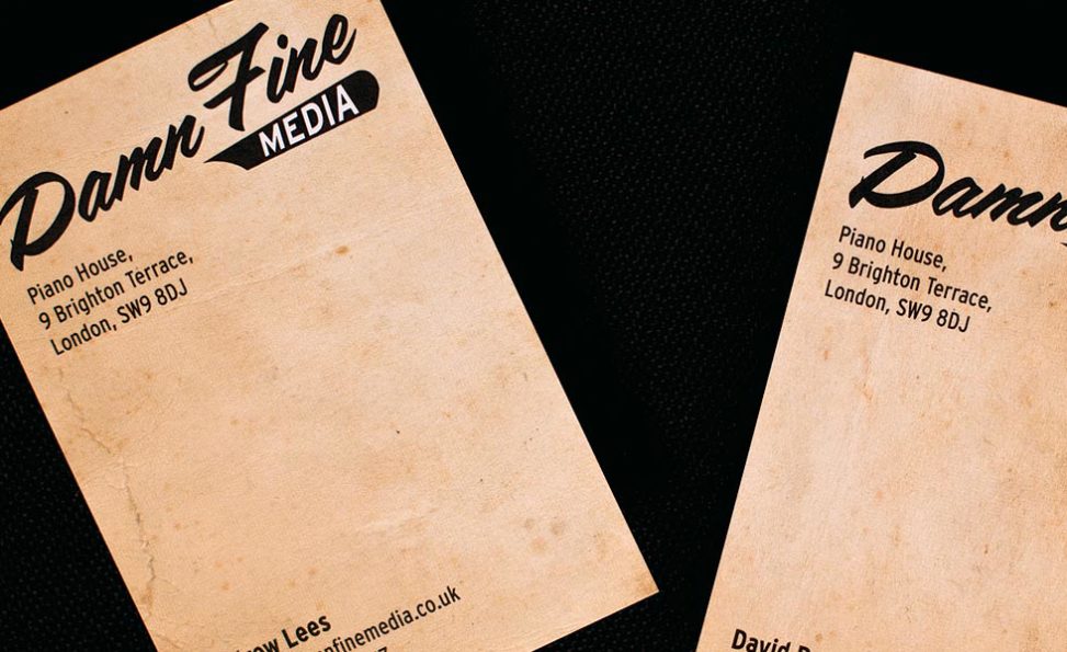


Damn Fine Media produce video and animation for TV and the web. They asked us to design their identity, citing old American signage and script typography as an inspiration. It had to work for at small sizes for digital use as well as in print for stationery.
We had to consider the logo appearing on screen at very small sizes for social media and as an identity to appear in the corner of web video screens..
On screen, a script typeface can be problematic at small sizes. With this in mind, we took great care to enhance the script and white space amongst the characters to make it clear whilst creating a memorable identity in whichever format it is needed.
For stationery we used distressed, worn backgrounds to echo a dusty, bygone era that the name Damn Fine Media suggests.

Comments are closed.